
01
Start with the headline
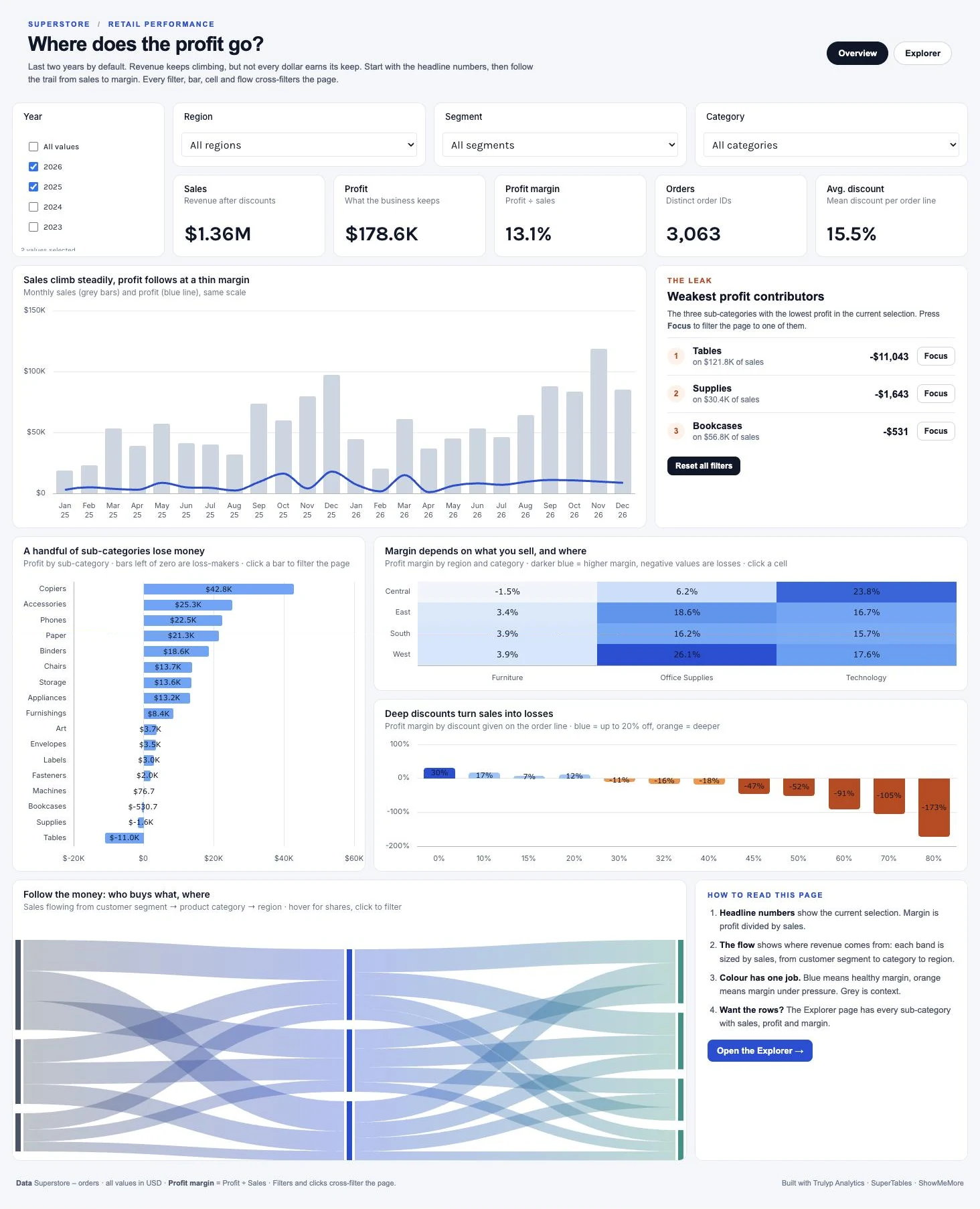
The page opens on the last two years. Five headline numbers and a monthly trend put sales and profit side by side, so the thin margin is the first thing you see.
- Filters
- KPI visuals
- Bar and line chart

Retail performance
Revenue keeps climbing, but not every dollar earns its keep. A two-page profit story that follows the money from headline numbers to the individual order.
Built in Trulyp Analytics on Superstore orders (sample data). Click the screenshot to open it at full size.
The analytical idea
Most sales dashboards answer one question: are we selling more? This one asks a harder one. Sales grow almost every month, yet profit stays flat. Somewhere between the invoice and the bottom line, money disappears. The dashboard is built to find out where.
Instead of a wall of charts, every visual answers the next question a manager would ask. You read it top to bottom like an argument: first the size of the problem, then where it sits, then what causes it, and finally the individual products, customers and orders behind it.
Five headline numbers and a monthly trend put sales and profit on the same scale, so the thin margin is visible at a glance.
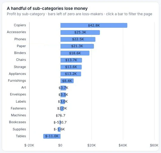
A ranked bar chart and a short list of the weakest sub-categories show which products lose money.
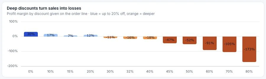
A heatmap and a discount chart separate two causes: what you sell where, and how much discount you give.
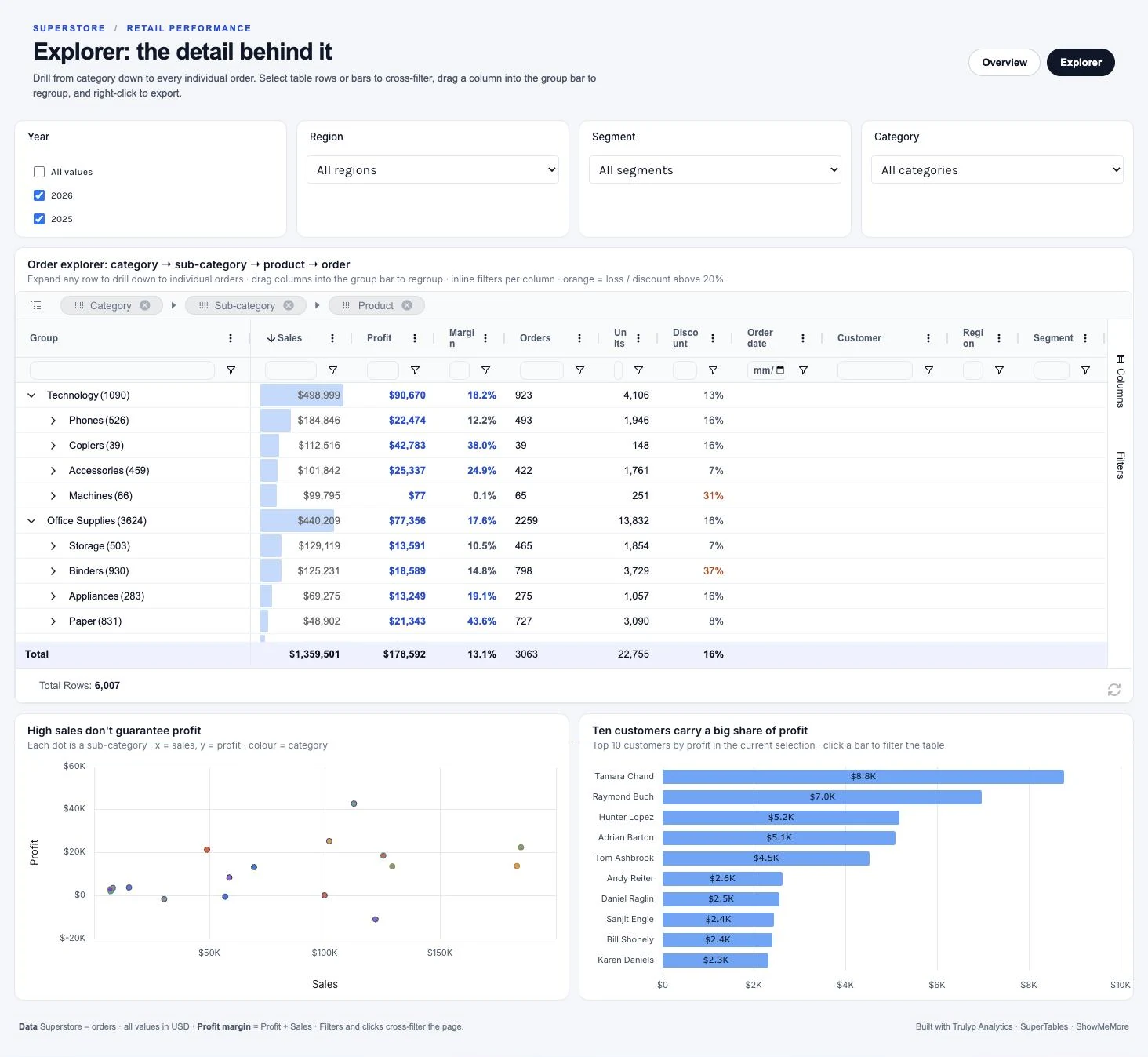
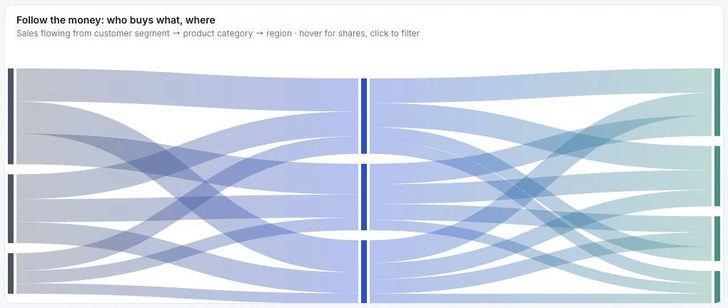
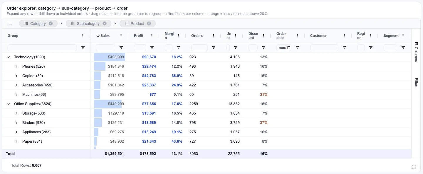
A Sankey flow and the Explorer page take you down to customers, products and single orders.
Why it matters
The dashboard turns a vague feeling (we sell a lot but earn little) into decisions someone can own. In the 2025 and 2026 sample data it surfaces three of them within a minute.
Tables lose $11,043 on $121.8K of sales. Machines sell almost $100K and earn $77. Those are pricing and sourcing conversations, not marketing ones.
Orders without discount earn a 30% margin. From 30% off onwards every discount level loses money, and at 80% off the margin is -173%. The chart makes the break-even point obvious.
Furniture runs at -1.5% margin in Central but at 3.4% to 3.9% elsewhere, while Office Supplies earns 26.1% in the West. The same product line needs a different plan per region.
Every bar, cell and flow filters the page, and the Explorer goes down to the order line. Nobody has to export a spreadsheet to check a number.
Inside the dashboard
The dashboard reads top to bottom in five steps, from the headline to a single order. Every filter, bar, cell and flow filters the rest of the page.
01
The page opens on the last two years. Five headline numbers and a monthly trend put sales and profit side by side, so the thin margin is the first thing you see.
02
Every sub-category ranked by profit, with the loss-makers on the wrong side of zero. A short live list names the three weakest and focuses the page on any of them in one click.
03
Two causes, side by side: what you sell where, and how much discount you give. Margin by region and category shows the weak spots; margin by discount level shows profit turning into losses beyond 20% off.
04
A flow from customer segment to product category to region shows where revenue comes from, before you judge its margin.
05
The Explorer page groups everything from category to product to the individual order, next to the top customers and a sales-versus-profit view. Click a customer and the table shows their orders.
Build it yourself
Everything here is standard Trulyp Analytics. In short, this is how it comes together.
Pick the Superstore orders data source and add one calculation for profit margin. One source for every visual is what makes cross-filtering work.
SUM([Profit]) / SUM([Sales])Order the page like the questions a manager asks: headline numbers first, then where profit leaks, why, and the detail behind it.
Year, Region, Segment and Category filters, with the last two years as the default, and five KPIs with clear number formats.
Native charts for the analysis, HTML visuals for the header and the live leak list, and the ShowMeMore and SuperTables extensions for the flow and the order detail.
Choose which visuals each filter and chart click affects, so every click tells one consistent story.
Trulyp Analytics combines native charts, HTML visuals and extensions on one canvas, connected to the data you already have.